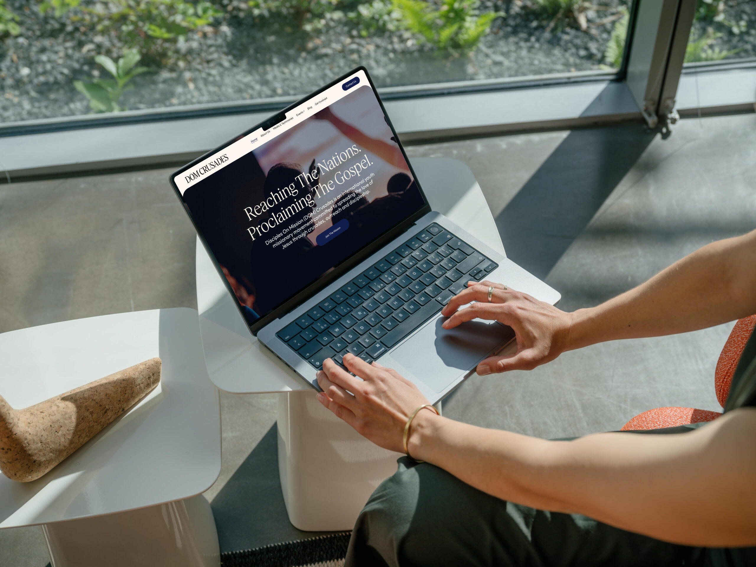
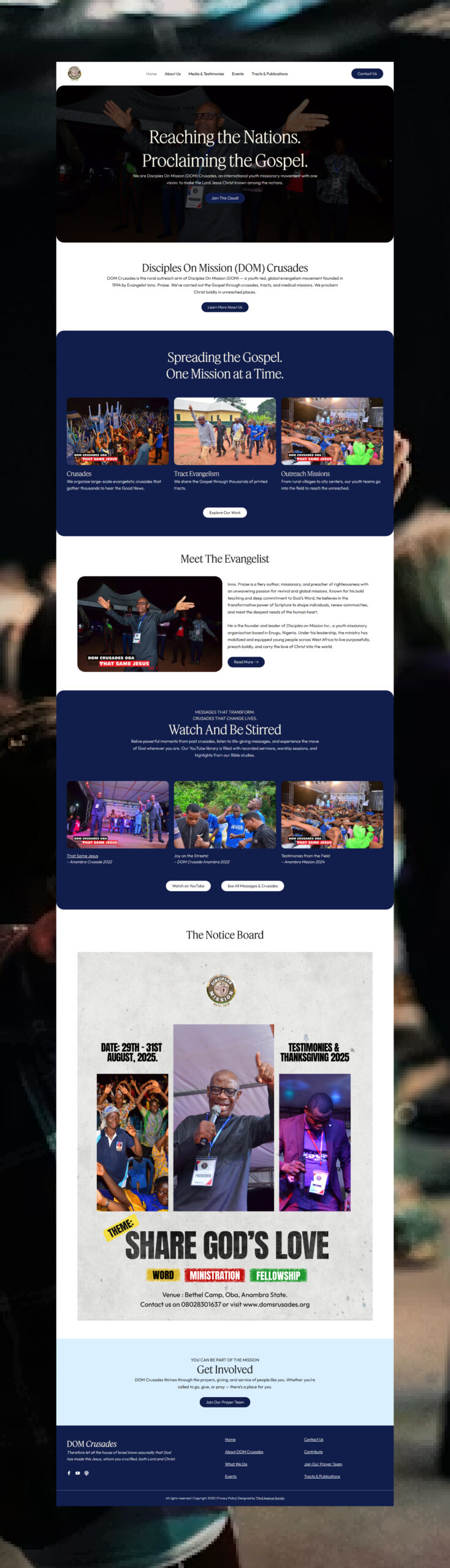
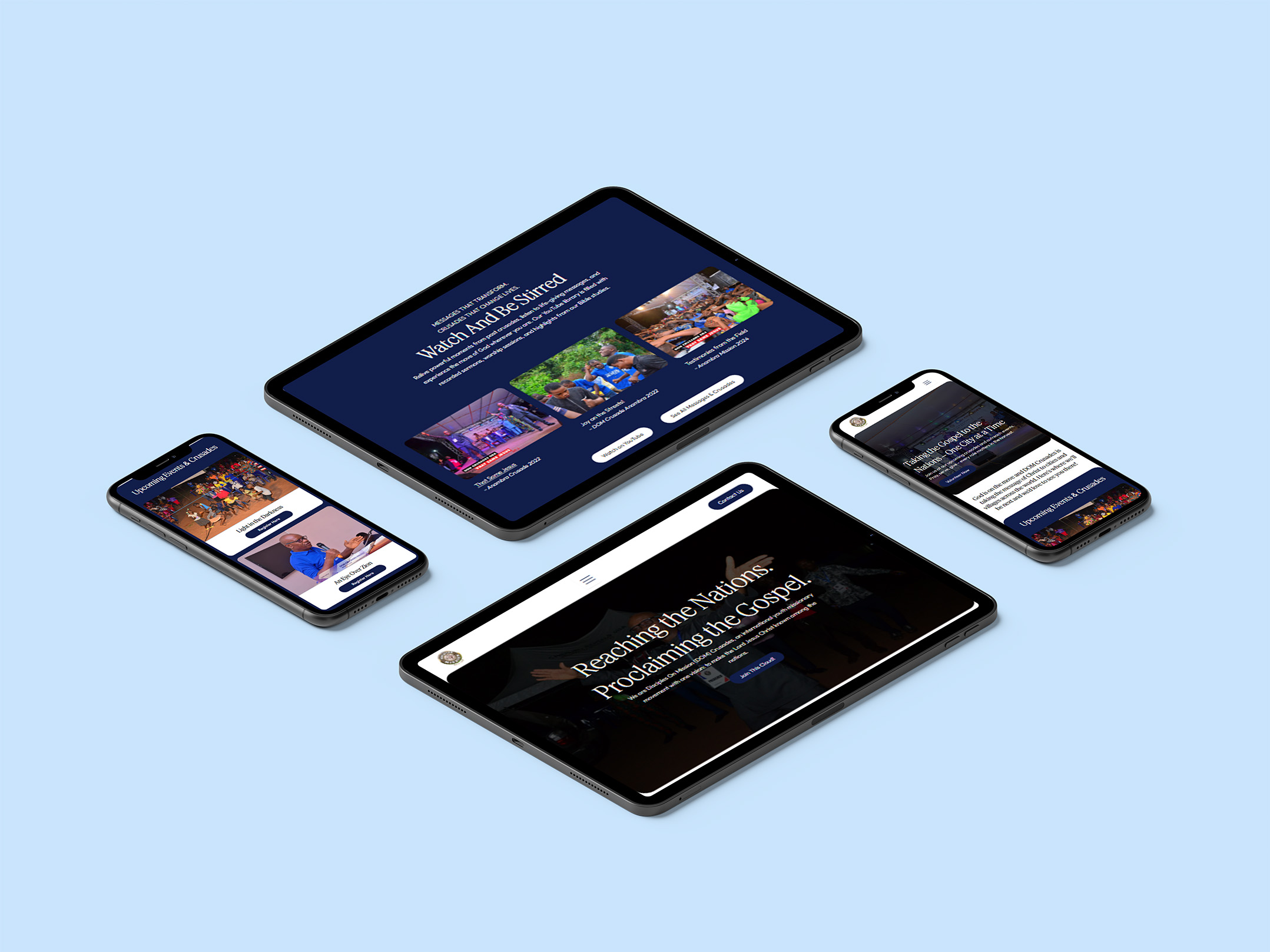
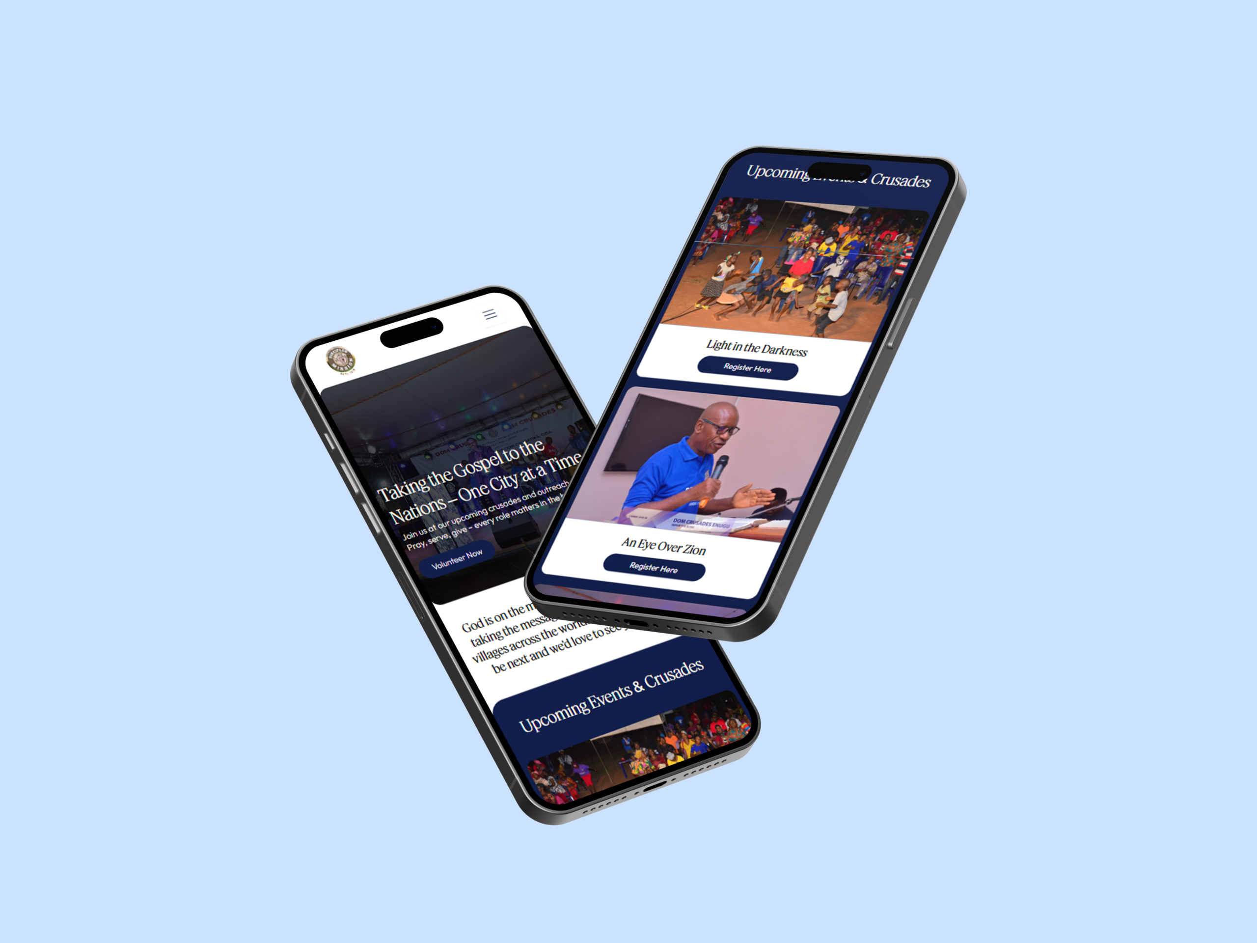
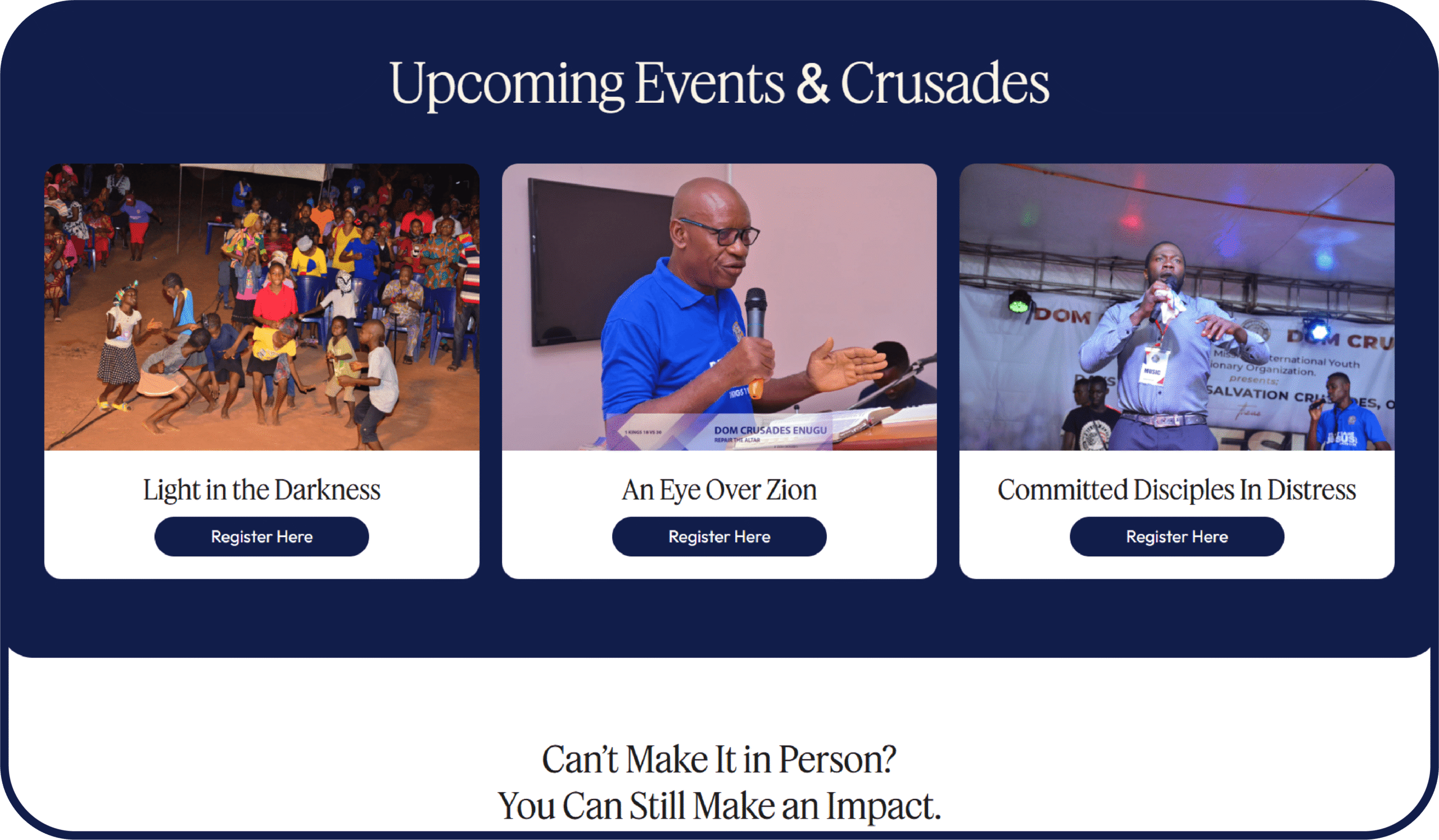
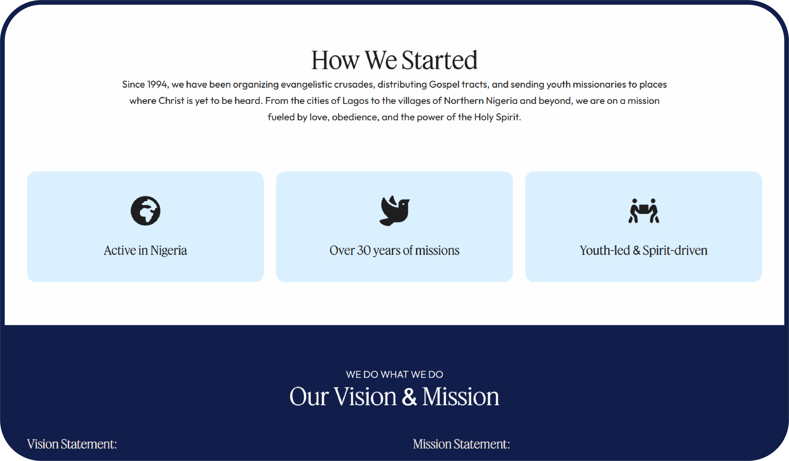
This project started with one simple question: how do we make people feel the mission, not just read about it? DOM Crusades isn’t just an organization, it’s movement-driven, faith-led, and action-oriented. So instead of approaching it like a typical “church website,” I positioned it more like a campaign hub.
DOM CRUSADES DOM CRUSADES DOM CRUSADES DOM CRUSADES DOM CRUSADES DOM CRUSADES DOM CRUSADES DOM CRUSADES DOM CRUSADES DOM CRUSADES DOM CRUSADES DOM CRUSADES
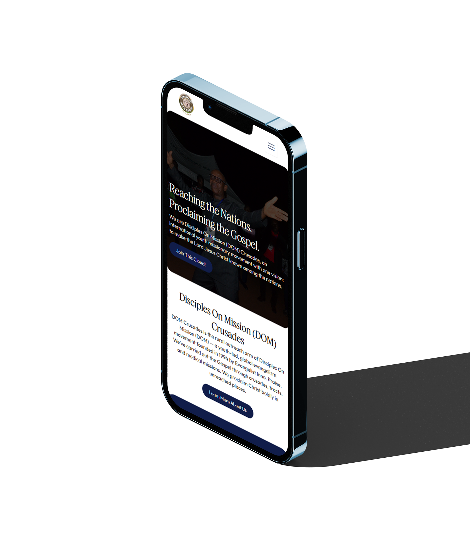
The design choices were less about aesthetics and more about alignment. The font had to feel grounded and trustworthy, but still modern enough to appeal to a younger, global audience, so I leaned into a serif that carries authority, paired with clean spacing to keep it from feeling dated. Colour-wise, I avoided anything too soft or passive. The palette needed to communicate urgency, faith, and movement, while still feeling warm and inviting.
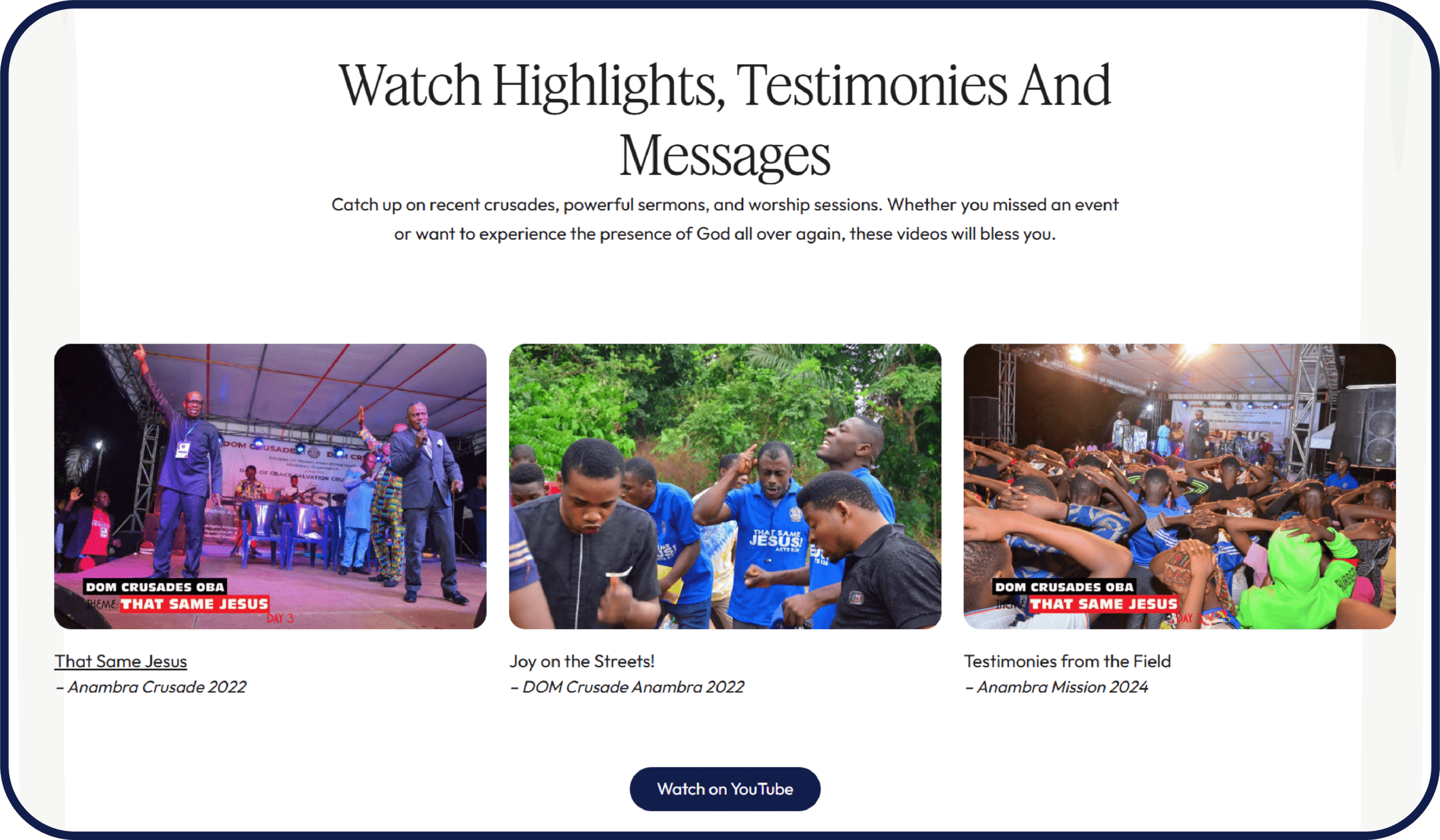
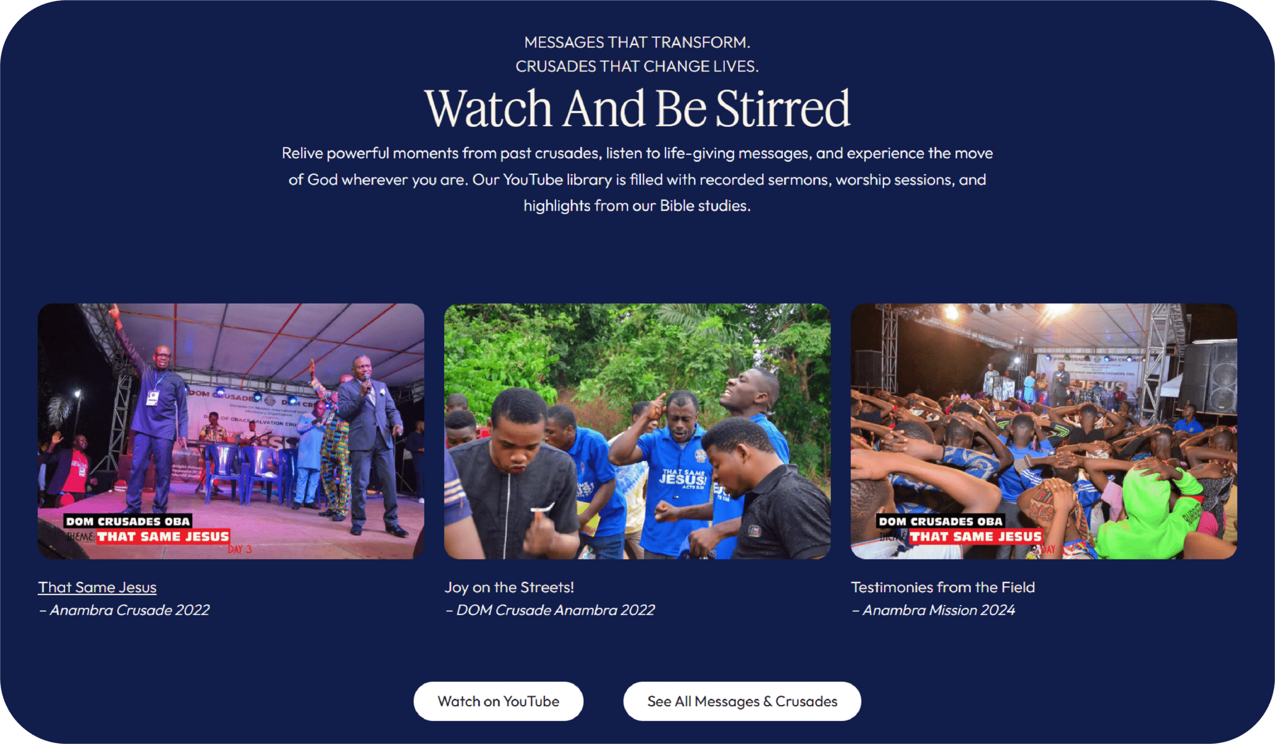
When it came to the copy, I stripped out anything that sounded overly formal or “churchy.” People don’t engage with stiff language, they respond to clarity and conviction. So the tone became more direct, more human, and slightly conversational. Instead of just stating what DOM Crusades does, the copy invites people in, speaks to their role in the mission, and subtly nudges them toward action.
Ready to Turn Your Website Into a Revenue Machine?
Here’s the thing: your website is either making you money or costing you money. There’s no in-between. If you’re ready to stop losing clients to competitors with better sites, pick your path and let’s get started.