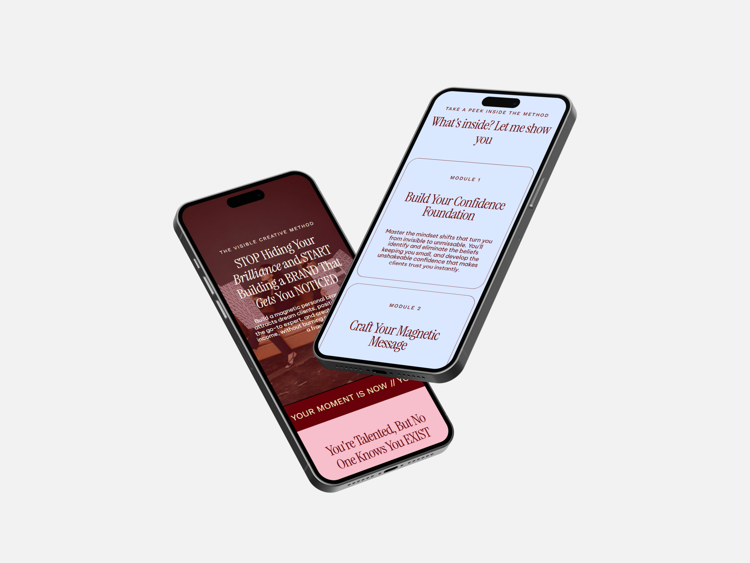
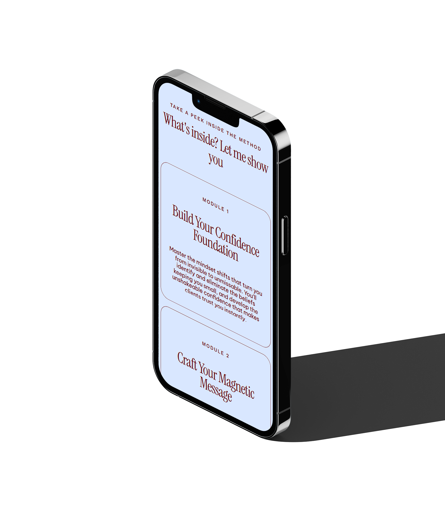
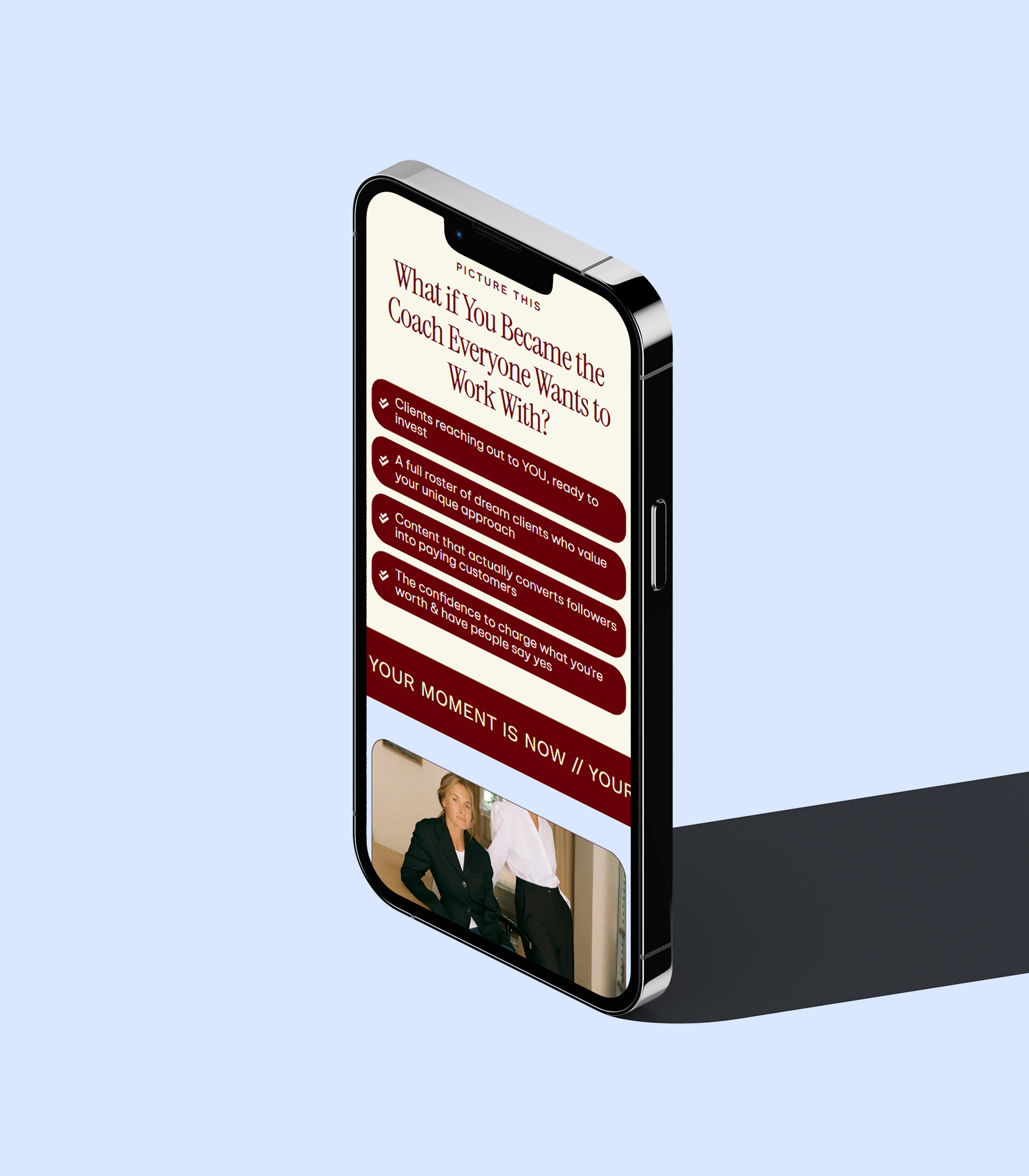
Aligned and Unstoppable was a passion project where I challenged myself to design a coaching website that actually feels like the transformation it’s selling. From the start, it was clear this wasn’t about cramming information onto a page, it was about guiding someone from “I feel stuck and unseen” to “this is exactly what I need.” That thinking shaped the entire flow.
ALIGNED AND UNSTOPPABLE ALIGNED AND UNSTOPPABLE ALIGNED AND UNSTOPPABLE ALIGNED AND UNSTOPPABLE ALIGNED AND UNSTOPPABLE ALIGNED AND UNSTOPPABLE ALIGNED AND UNSTOPPABLE ALIGNED AND UNSTOPPABLE
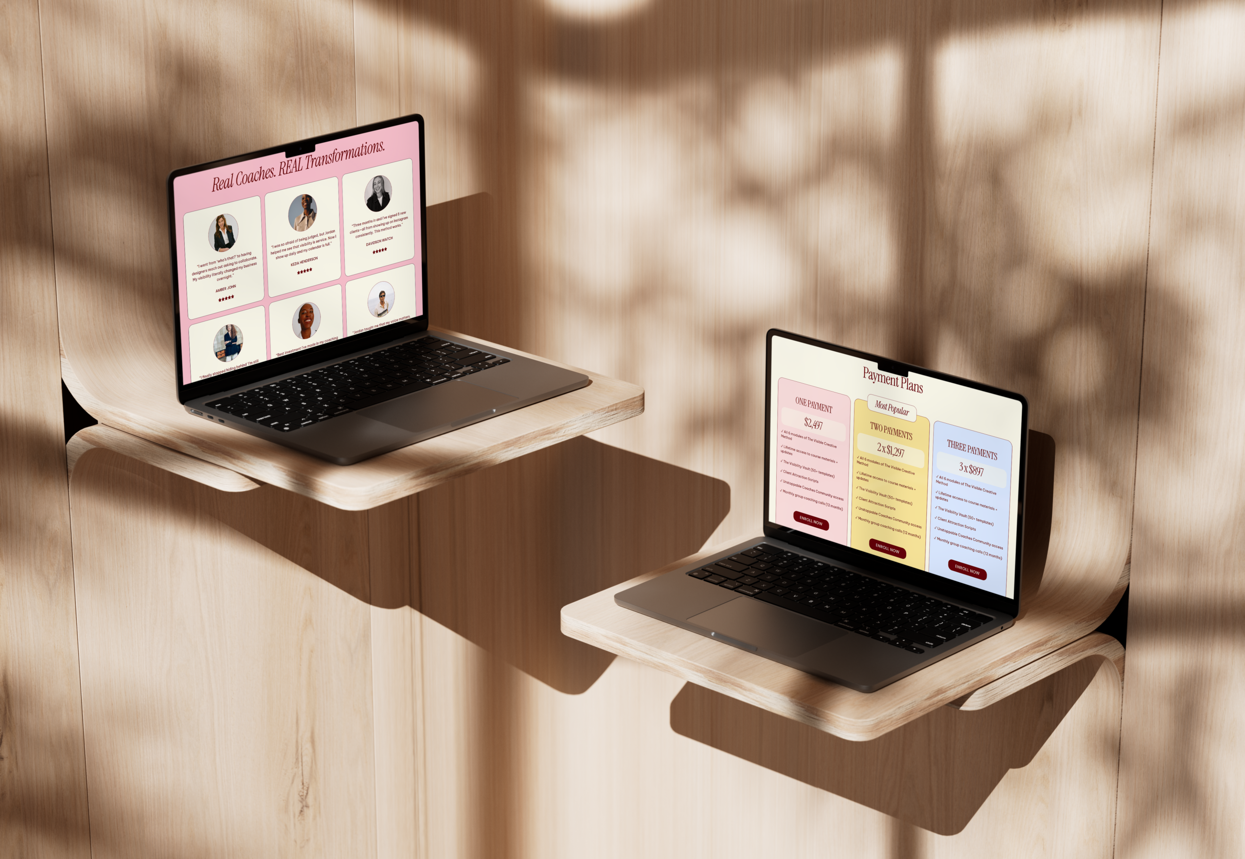
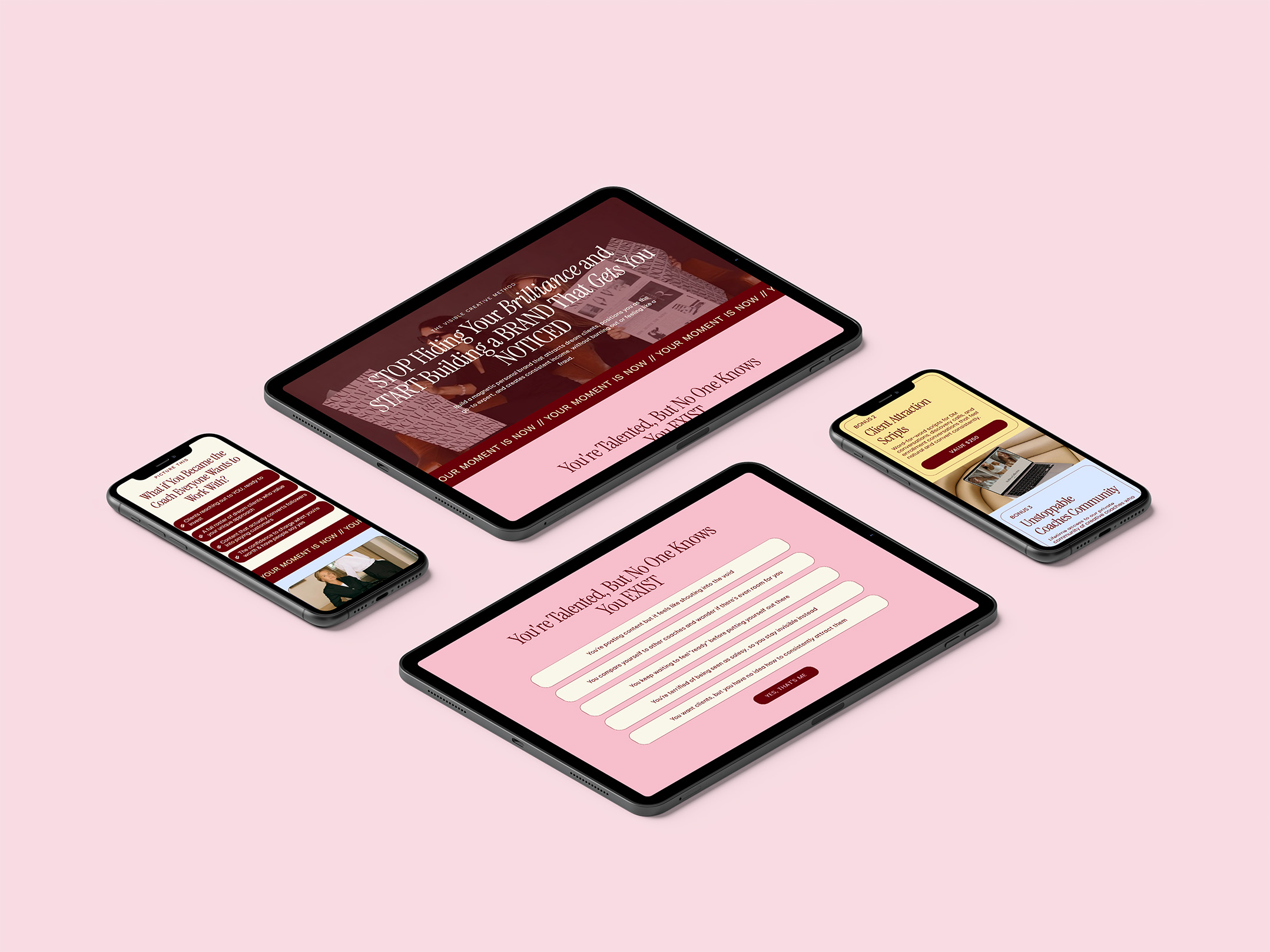
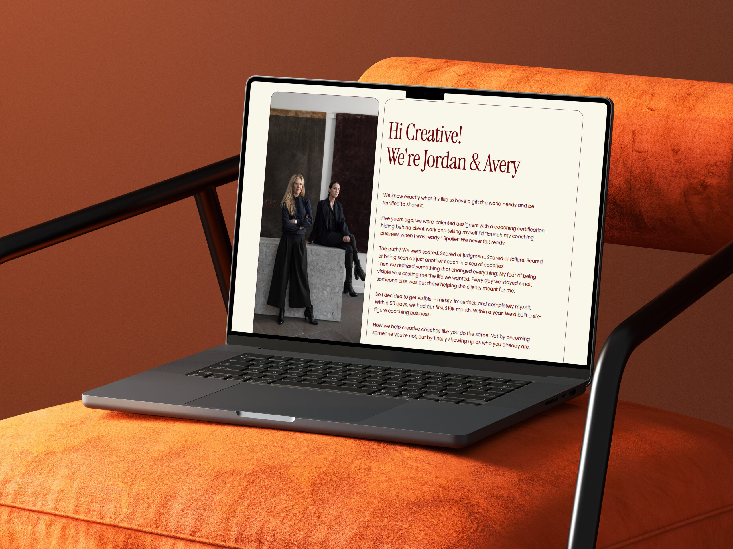
Behind the scenes, the design choices were very intentional. I leaned into a soft but confident colour palette; pinks, creams, and deep reds to balance warmth with authority. A lot of coaching websites either feel too aggressive or too passive, so the goal here was grounded confidence.
The typography follows that same logic: elegant and slightly editorial to elevate the brand, but still clean enough to keep everything readable across long sections. You’ll notice the layout isn’t overly minimal either, I used layered sections, cards, and visual breaks to keep the page dynamic, because this kind of offer relies on holding attention all the way through.
Ready to Turn Your Website Into a Revenue Machine?
Here’s the thing: your website is either making you money or costing you money. There’s no in-between. If you’re ready to stop losing clients to competitors with better sites, pick your path and let’s get started.